1. Responsive Video
This responsive video CSS trick was discovered by tjkdesign.com. It makes the video embed to expand fullwidth to the boundary.
.video {
 position: relative;
 padding-bottom: 56.25%;
 height: 0;
 overflow: hidden;
}

.video iframe,
.video object,
.video embed {
 position: absolute;
 top: 0;
 left: 0;
 width: 100%;
 height: 100%;
}
2. Min & Max Width
Max-width property allows you to set the max width of the element. The purpose of max-width is to prevent the element from extending the boundary.
Max-Width Container
In the example below, I specify the container to display at 800px if possible, but it should not exceed 90% of the boundary width.
.container {
 width: 800px;
 max-width: 90%;
}
Responsive Image
You can make the image auto resize to the max width of the boundary by using max-width:100% and height:auto.
img {
 max-width: 100%;
 height: auto;
}
The above responsive image CSS works on IE7 and IE9, but doesn't work on IE8. To fix it, add width:auto. You may apply a conditional CSS specifically for IE8 or use the IE hack below:
@media \0screen {
  img {
   width: auto; /* for ie 8 */
  }
}
Min-Width
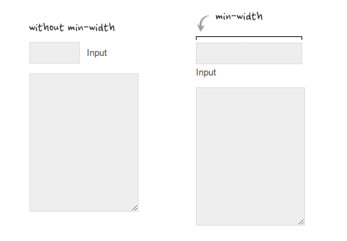
Min-width is opposit to max-width. It sets the minimum width of an element. In the example form below, min-width is used on the input text field to prevent the input from getting very small when scaling down.
3. Relative Values
In responsive design, knowing when to use relative value can simplify the CSS and maximize the best layout result. Below are some examples.
Relative Margin
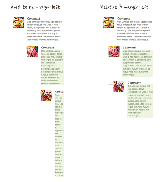
Below is an example of a commentlist where relative left margin is used to space out the threaded comments. Instead of using fixed pixel value, I used percentage value to space out the sub-lists. As shown on the left side of the screenshot, the content box in the sub-lists gets very small on mobile resolution if pixel left margin was used.
Relative Font Size
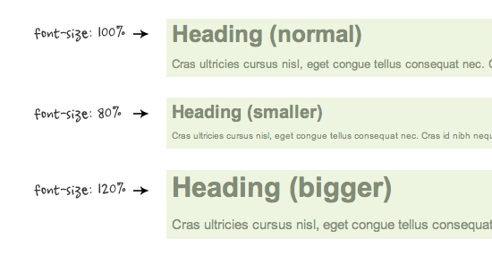
With relative value (eg. em or %), the font size, line-height and margin spacing can be inherited. For example, I can change the font size on all descendant elements by simply changing the font-size on the parent element.
Relative Padding
The screenshot below shows it is better to use relative percentage padding as opposed to fixed pixel padding. The box on the left shows an unbalanced padding space if pixel padding was used. The box with percentage padding on the right shows that the content area is maximized.

4. Overflow:hidden Trick
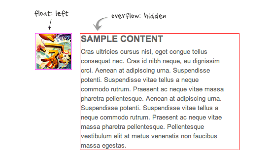
As posted in my previous article, you can clear float with the overflow property. This trick is extremely useful. You can clear the float from the previous element and keep the content running within the container by applying overflow:hidden.
5. Word-break
I also talked about the word-wrap property before. You can force unbreaking text (eg. long URL text) to wrap instead of running in a single line.
.break-word {
  word-wrap: break-word;
}
No comments:
Post a Comment